First impressions matter. They always have. Whether face-to-face or virtual, a good first impression can be the difference between winning or losing business. But now? Instead of 5 minutes, you get 5 seconds. Max.
We’re living in an online world with masses and masses of media at our fingertips. Information is at an all-time high and concentration at an all-time low. There is so much stuff on the web. Users are either going to engage with what they care about, or scroll right past.
That’s why it’s important to create “thumb-stopping” content.
What’s that? The name says it all. It’s attention-grabbing content that causes the user to stop scrolling. The easiest way to get someone to focus on your content? Connect with them. Really connect with them.
Stories are a great way to do this. And I’m not referring to Instagram here. From the earliest recorded history, storytelling was a method used by cavemen to share, communicate and entertain members of their tribe. The better the story, the better the engagement. Huh, maybe I am referring to Instagram. Who doesn’t love a good narrative though?
Stories are still around. They just look different. We’ve swapped cave paintings and fairytales for books and movies. But it doesn’t end there. Stories are told through colours, shapes and layouts too. That’s right; messages can be communicated through visual elements. And they are, all the time. If a designer gets the intended message across effectively, then it’s a great story; no less than the one from a writer.
So, as a designer, how can we tell a story?
Focus on the user. Not the product.
Get to know your target audience. It’s important that you find out what it is they care about. That way, you’ll understand their circumstances and be able to create something that says, “This company? It’s tailor-made for people like you." Of course, without using those words.
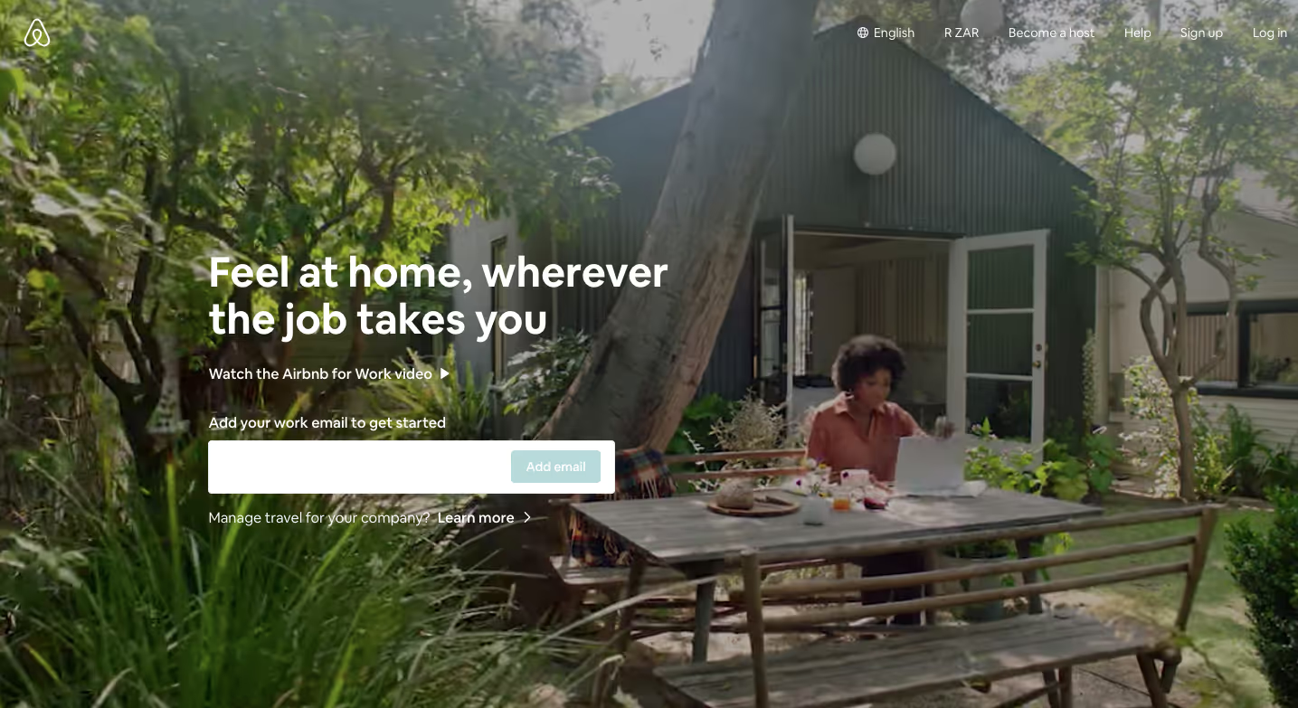
Like Airbnb, for example. When Airbnb expanded to include the business traveller, they envisioned a suit, briefcase and busy work schedule. Were they right? Nope. The modern-day business traveller wears comfy clothes, travels with a laptop and makes time for play. Luckily, Airbnb figured this one out on their own. So, they built an experience for people who enjoyed travelling for work, wanted to embrace the local culture and got a kick out of exploring.

Context vs Content
We’ve all heard the saying. “If content is king, context is queen.” Context is what makes things valuable to the reader. Or, adversely, meaningless. If you understand the context of a user’s situation, you’ll be able to approach it with the right messaging. And if you can do that, then you’ll be a central element in their own story.
Tradition’s out. Emotion’s in.
Ever heard of a creative license? Well, it’s yours. Use it however you like. But if there’s one thing you aim to do, it should be to evoke emotion. Your choice of photography, typography, tone of voice and UI elements can say as much as a full story, if not more. And that’s what people will remember your brand by.
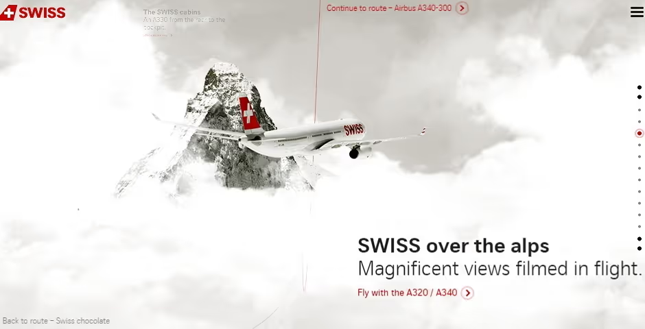
See this airline company? This is what we’re talking about. Their choice of information architecture, typography and imagery takes you on a flight over the Swiss alps. Just for a few seconds.

How about a brand mascot?
Hear me out. Loads of companies are using brand mascots. The Michelin Man, Rich Uncle Pennybags from Monopoly, or even Mr Muscle. Brands that give a face to their company seem to stay at the top of consumers’ minds. Is it because these mascots act as spokespersons and storytellers? Probably. And people love it!
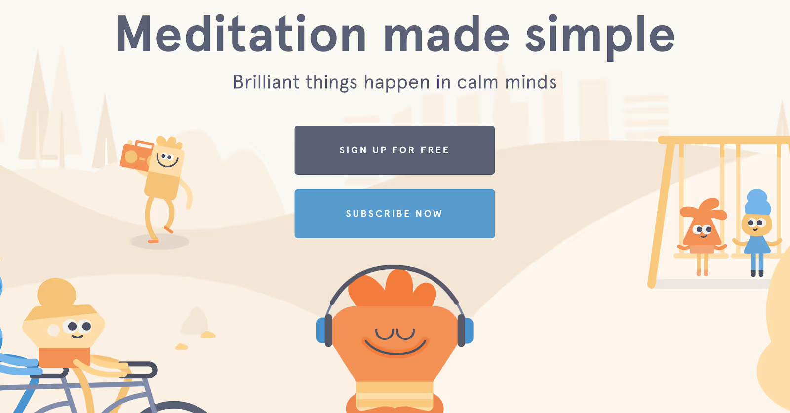
Think of Headspace. Their funny-looking creatures guide you on a journey to mindfulness. They look pretty peaceful. So it must work, right? It’s random. But without them, it wouldn’t be Headspace.

Vision for a better future
“The perfect world? It doesn’t exist. Yet! But with our brand, you’ll be one step closer to it.” This is one of the most successful storytelling approaches. People are trying to do better. So encourage them, with your brand.
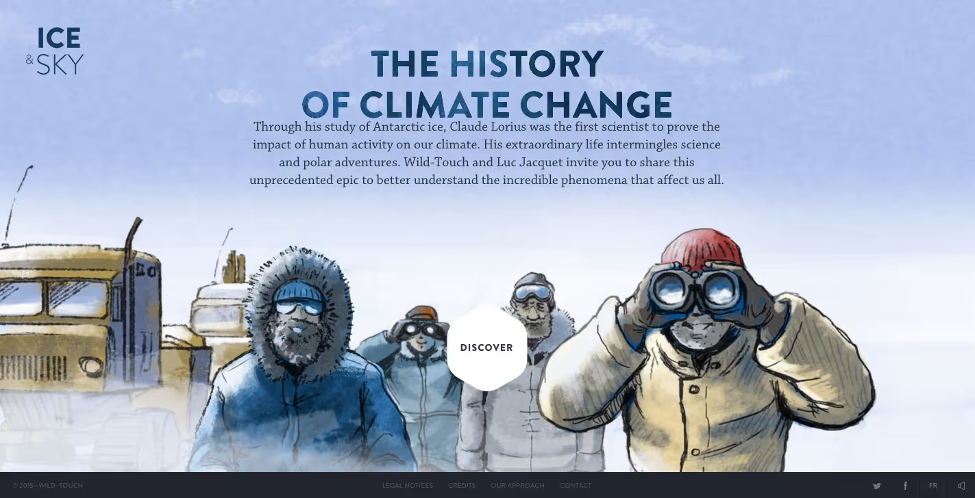
In this Ice And Sky homepage, the viewer is taken on a visual and educational journey. How? Through a variety of historical media and animations. It’s inviting. It’s righteous. And it even looks like a storybook.

Good design is like…
A well-written book. All the words have been carefully chosen to guide the reader on a journey from start to finish, ending with an overall message. It’s the same for designers. If the viewers get the message, it means it’s been effectively communicated. And that’s what makes a design a good one.


